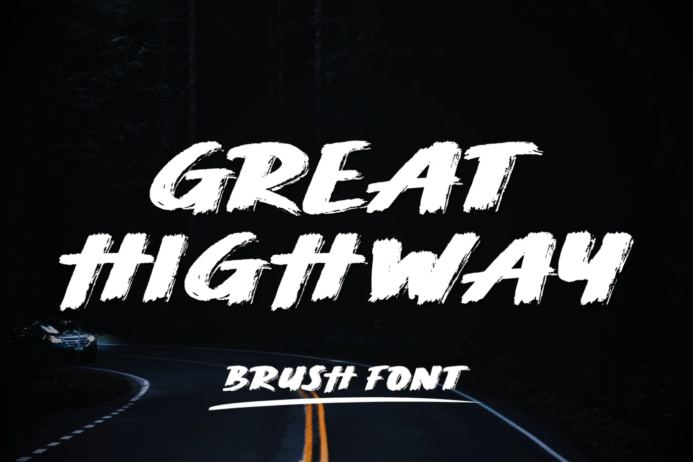
Most good layouts use two fonts: one with personality and one that does the work. Getting that pair right is less about rules and more about contrast. The two fonts should be clearly different, but they should not argue.
Give each font a job
Decide which font is the voice and which is the reader. The voice is your script, brush or display font. It carries the mood and appears in a few words: a headline, a name, a product title. The reader is a serif or sans serif for everything people actually need to read.
When both fonts try to be the voice, the design feels noisy. When both are quiet, it feels like a document.
Pairings that rarely fail
Script with a clean sans serif
The classic combination for beauty brands, cafés and invitations. A flowing script for the name, a simple sans in small caps or a light weight for details. The more decorative the script, the plainer the sans should be.
Brush font with a bold sans
For social graphics, sports and food. A brush font like Great Highway brings energy; a heavy sans underneath gives the message weight. Keep the brush to three or four words.
Display serif with a script accent
For editorial and fashion layouts. A high-contrast serif carries the headline, and a small script word adds warmth, for example “the” or “collection” set between the bigger words.
Rounded display with a friendly sans
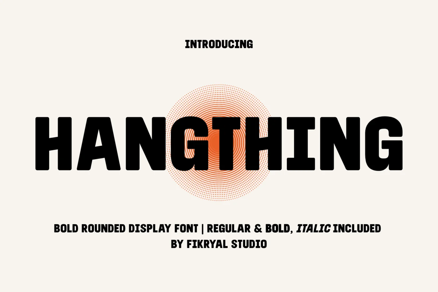
For packaging, kids’ brands and snacks. A rounded font like Hangthing on the front of the pack, a humanist sans for ingredients and descriptions.
Three checks before you commit
- Squint test. Blur your eyes. You should still see a clear difference in weight and shape between the two fonts.
- Size gap. The voice font should be at least twice the size of the reader font. Similar sizes make them compete.
- Mood match. A playful brush next to a strict geometric sans can work, but only if the contrast is intentional. If it feels accidental, swap one of them.
Try pairs before you buy
Type your real text into the tester on any font page, or use the Logo Tester to see your brand name in every font at once. Place it next to the sans or serif you already use and look at it at the size it will actually be printed or seen.