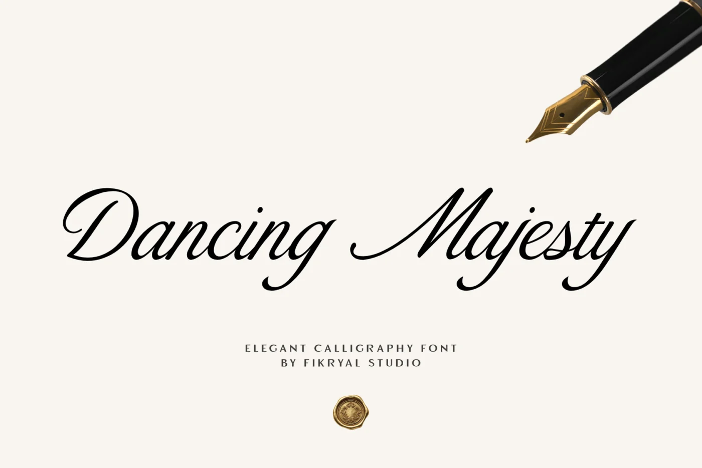
A wedding invitation is usually read twice: once quickly when it arrives, and again when someone checks the date and the address. The type has to feel special on the first read and be perfectly clear on the second. Scripts can do both, but only if you use them with a light hand.
Use the script for names, not for everything
The couple’s names are the emotional centre of the card. That is where a calligraphy or script font belongs. Dates, times, addresses and RSVP details should be set in a calm serif or sans serif. Guests will thank you when they are looking for the venue on their phone.
A good rule: if a line contains a number, do not set it in a script.
Pick a script that matches the wedding
- Formal and classic: high-contrast calligraphy with long entry and exit strokes, like Dancing Majesty.
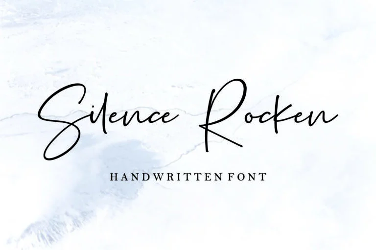
- Modern and relaxed: a handwritten script with a natural rhythm, like Silence Rocken.
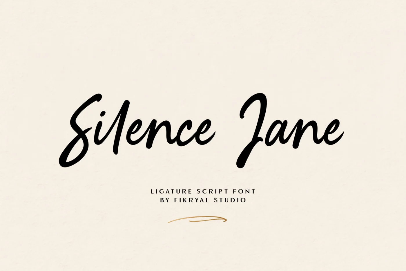
- Romantic with a signature feel: a script with ligatures that link letters into one flowing shape, like Silence Jane.
Type the actual names before you decide. Some scripts look beautiful in the preview but create awkward joins with specific letter pairs. Our type tester on every font page lets you check this in seconds.
Size and spacing
Scripts need more size than you think. On a standard 5×7 inch card, names usually look right between 36 and 60 pt, depending on how compact the script is. Never track a script out with extra letter spacing; it breaks the connections between letters. Give it room above and below instead.
Use the alternates
Many of our scripts include swashes and alternate letters. A single swash on the first letter of each name, or a tail on the last letter, adds a hand-lettered feel. One or two per name is plenty. In Illustrator, InDesign or Affinity you can reach them through the Glyphs panel.
Printing tips
- Thin hairlines can disappear in foil or letterpress. Ask your printer for a test, or choose a script with slightly stronger thin strokes.
- Convert text to outlines before sending files to the printer, so nothing is substituted.
- For gold foil, avoid very small text in script. Keep foil for the names.
About the license
If you are designing your own invitation and nobody is paying for it, the free personal-use demo is fine. If you design invitations for clients or sell invitation templates, you need a paid license. For printed invitations sold to clients, the Desktop License covers up to 2,000 prints. For templates sold on platforms like Etsy or Corjl, look at the Monetized Social Media License, which allows embedding the font in tools like Canva, Templett and Corjl.