Most logo fonts get chosen on a big screen at 120 points, which is the one size the logo will almost never appear at. Before you settle on one, run these five tests. They take about ten minutes and can save you a rebrand later.
1. The avatar test
Shrink the logo into a circle about the size of an Instagram profile picture on a phone. Fine hairlines and tight loops disappear first. If the name falls apart at that size, either choose a sturdier font or plan a short version, like an initial or a monogram, for small spaces.
2. The real-name test
Type the actual brand name, not “Brand Name” or “Your Logo”. Script fonts behave differently letter by letter. Double letters like ll, tt and ss, and the capital at the start, are where a script either looks natural or falls apart. Our Logo Tester shows your name in every font at once, so you can compare them side by side.
3. The one-second test
Show the logo to someone who has never heard of the brand and ask them to read it out loud. If they hesitate or get it wrong, the font is doing too much. A clearer style, a bigger size, or a short sans line underneath usually fixes it.
4. The material test
Think about where the logo will be produced, not just displayed. Embroidery, foil stamping, laser engraving and small vinyl stickers all struggle with thin strokes. Ask your printer for their minimum line thickness before you finalise, especially for script and calligraphy styles.
5. The five-year test
A logo stays around much longer than a social post. Extra swashes and trend-heavy shapes feel fresh this year and tired in three. Pick a font for the personality of the brand, not the look of the moment.
Match the style to the brand
None of these are rules, but customers do read these signals:
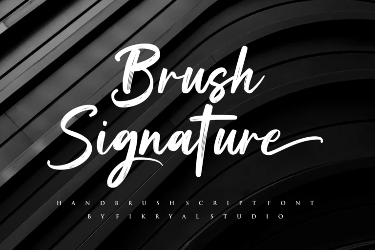
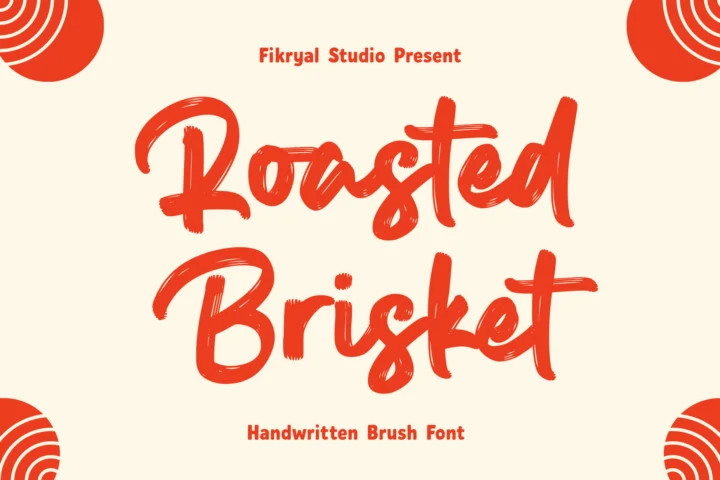
- Brush scripts feel energetic and hands-on. They suit coffee shops, apparel, food brands and creators. Brush Signature is a good starting point.
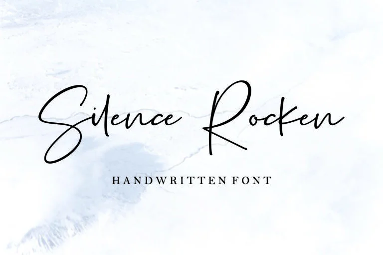
- Signature and handwritten styles feel personal, as if the founder signed it. They work for photographers, beauty brands and personal brands. Try Soul Signature or Silence Rocken.
- Calligraphy feels formal and premium, which fits weddings, fragrance and jewellery. Deutschlands is built for that.
Make the font yours
A logo should not look like someone typed the name and pressed save. Convert the text to outlines, tighten the spacing between words a little, and adjust the join between the first two letters if it looks awkward. Pair the name with a small, widely spaced sans for the descriptor, such as STUDIO or SKINCARE. Editing the outlines does not change the font license, so you still need the right one.
Check the license before you launch
A logo that only lives on signs, packaging and printed products is covered by the Desktop License. Most brands also put their logo on social media and a website, and for that mix the Extended License is usually the most economical choice.
If you plan to register the logo as a trademark, look closer. Trademark use is only included in the National Corporate License and the Worldwide Corporate License. Our license guide explains each one in plain words.
When a ready-made font is not enough
Sometimes a brand needs letters nobody else has. We design custom logos and custom fonts for brands that want a mark of their own. Send us a short brief with your brand name, where the logo will be used and two or three references you like, and we will reply with options.