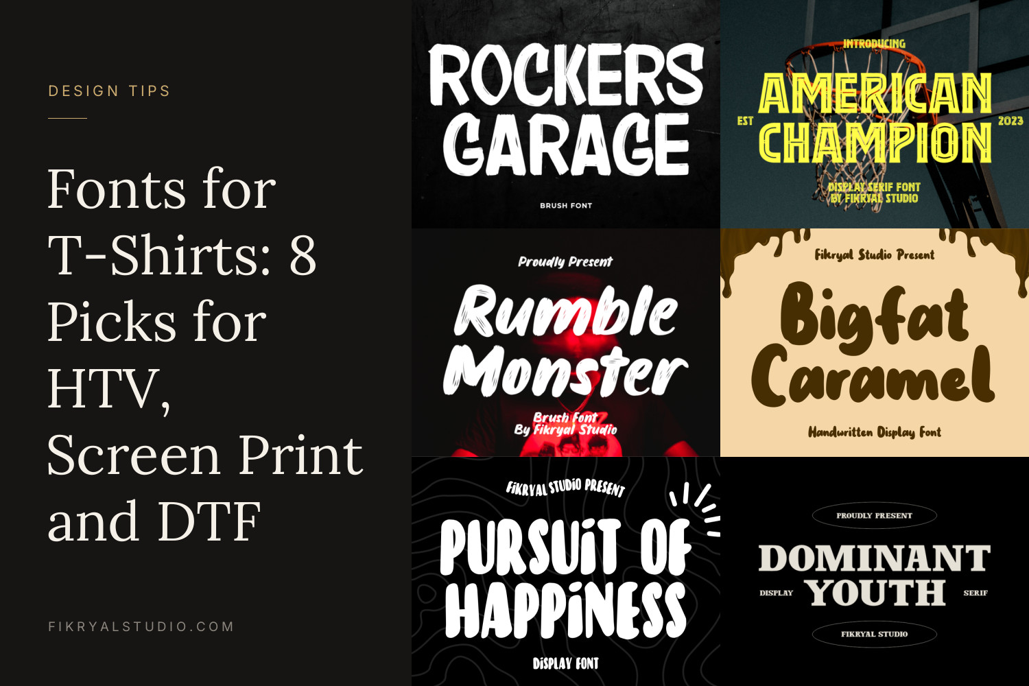
A font that looks great on screen can turn into a smudge on a shirt. Thin hairlines vanish in heat transfer vinyl, rough brush texture becomes a weeding nightmare, and a delicate script reads as a scribble from three metres away.
This guide picks eight fonts for t-shirts from our catalogue, says which print method and garment each one suits, and gives you the size and spacing numbers to check before you press or order.
Quick picks
- Band, garage and streetwear graphics: Rockers Garage
- Team shirts, college and sports merch: American Champion
- Energetic slogan tees with movement: Rumble Monster
- Kids’ shirts and easy HTV cuts: Bigfat Caramel
- Quote and mood shirts: Pursuit Of Happiness
- Minimal streetwear wordmarks: Dominant Youth
- Left-chest signature logos: Brush Signature
- Gym, fitness and sports club tees: Endurance Gesture
8 fonts for t-shirts and where each one works best
1. Rockers Garage
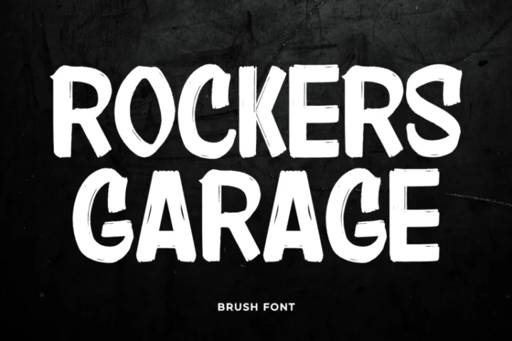
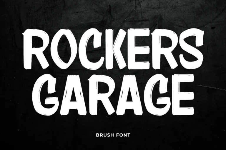
Rockers Garage is a heavy, all-caps brush display font. The letters are tall and tightly packed, with slightly rough edges that keep them from looking digital. Set in two stacked lines, it fills a chest print the way a band logo or a workshop sign does.
It shines on dark garments in white or a single bright ink, especially for screen printing and DTF, where the edge texture survives. For HTV, keep the word count low and the print at least 20 cm wide so the rough edges stay part of the letter instead of becoming loose specks. See Rockers Garage
2. American Champion
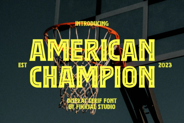
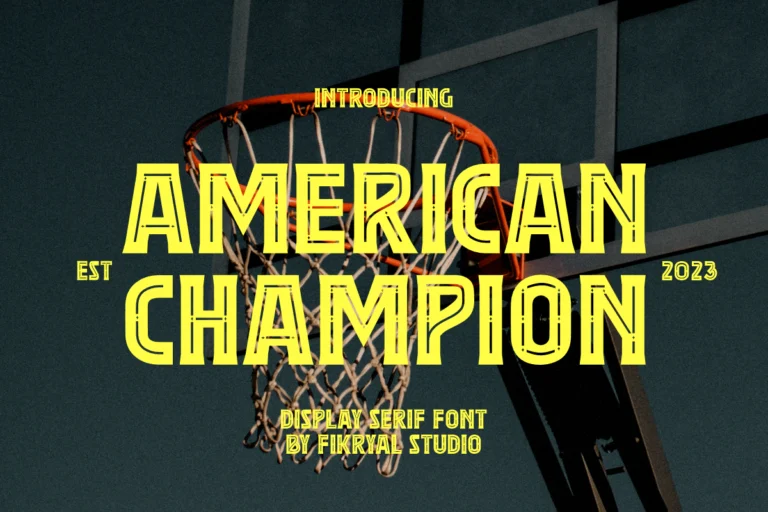
American Champion is a condensed display serif with blocky, sporty capitals. It has the straight-backed confidence of a varsity jacket or a stadium banner, and its narrow width lets you fit a long team or school name across the chest without shrinking it.
Use it for team shirts, reunion tees, club merch and anything with a number or a year under the name. A simple trick: set the name in American Champion, then add a thin outline or a second colour behind it with Offset in Cricut Design Space for that classic two-layer sports look. See American Champion
3. Rumble Monster
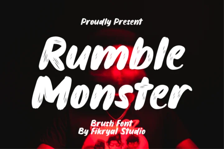
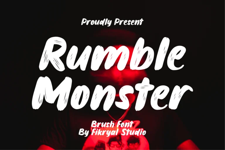
Rumble Monster is a bold, slanted brush font in upper and lower case. The strokes are thick and fast, with dry-brush edges at the ends, so a short phrase looks hand-painted rather than typed. The forward lean gives slogans a sense of speed.
It works for event shirts, food truck crews, skate and BMX merch and loud one-liners. Keep it to two or three words per line and let the slant run uphill slightly; rotating the whole text block 5 to 8 degrees adds energy without hurting legibility. See Rumble Monster
4. Bigfat Caramel
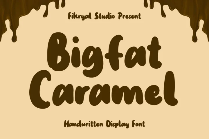
Bigfat Caramel is a chunky handwritten display font with soft, rounded strokes and smooth edges. The letters are wide and friendly, a little uneven in a hand-drawn way, and they stay readable even on a toddler-size shirt.
This is the easiest font in the list to cut and weed. The thick strokes and closed counters hold up in HTV at small sizes, which makes it a strong choice for kids’ names, birthday shirts, family trip tees and teacher shirts. Tighten the letter spacing a little so the word reads as one shape. See Bigfat Caramel
5. Pursuit Of Happiness
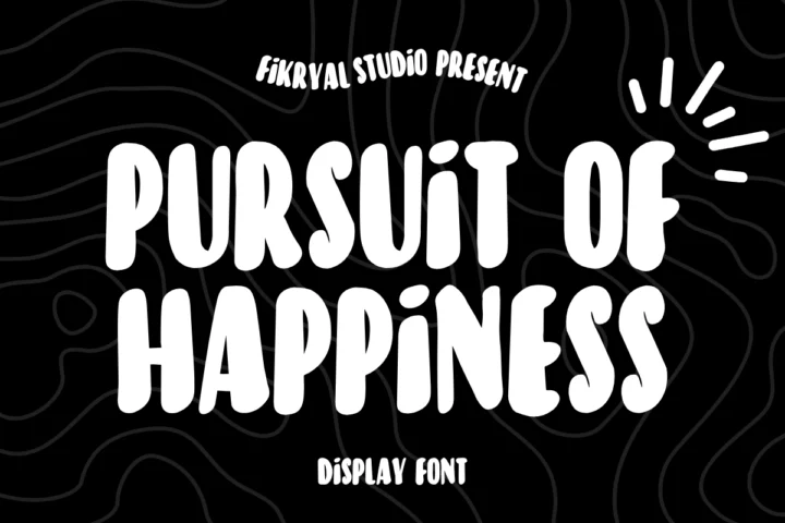
Pursuit Of Happiness is a playful handwritten all-caps font. The letters bounce off the baseline and vary in width, which gives quotes a casual, drawn-by-hand rhythm. The product description notes extensive multilingual support, useful if you sell shirts with phrases in several languages.
Use it for quote shirts, mood tees and slogans of four to eight words. Stack the phrase in three or four short lines and centre it; the bounce looks intentional when lines are short and messy when one line runs long. See Pursuit Of Happiness
6. Dominant Youth

Dominant Youth is a display serif with wide capitals, sharp serifs and clear contrast between thick and thin strokes. It looks editorial rather than sporty, closer to a fashion label or a vintage hotel sign.
It suits minimal streetwear, small-brand wordmarks and back-neck prints. Because of the thin strokes, print it at least 8 cm wide for HTV, or use screen printing or DTF for smaller marks. Wide letter spacing of around 100 to 200 in Canva or your design app gives it a calm, premium look. See Dominant Youth
7. Brush Signature
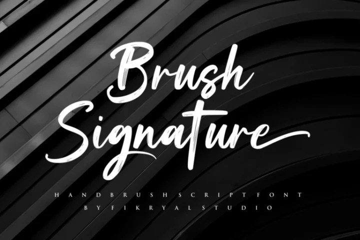
Brush Signature is a dry-brush script with fast, natural strokes and beginning and ending swashes, as listed in the product features. It reads like a name signed with a brush pen, which is exactly what a clothing brand or creator signature on a chest needs.
Use it for left-chest logos around 9 to 10 cm wide, sleeve prints and small brand marks above a pocket. The brush texture is best kept in screen print, DTF or embroidery digitised by a pro; for HTV, set it larger, use the swashes sparingly and run a test cut first. See Brush Signature
8. Endurance Gesture
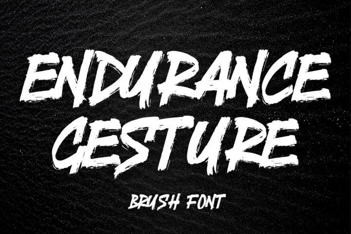
Endurance Gesture is a heavy brush font in slanted capitals with a gritty, distressed finish. The strokes look dragged and pressed, which matches sweat, effort and competition.
It belongs on gym shirts, running club tees, combat sports merch and training camp hoodies. Pair a big two-word headline in Endurance Gesture with a small line of plain sans serif for the club name and year. For HTV, simplify by printing it larger; for DTF and screen print, the texture can stay. See Endurance Gesture
How to choose a t-shirt font: three tests
- The three-metre test. Print your design at real size on paper, tape it to a wall and step back three metres. If you cannot read the main word in two seconds, choose a heavier font or cut the text.
- The thinnest stroke test. Zoom in on the thinnest part of the smallest letter. As a rule of thumb, strokes under about 1 mm are risky in HTV and can lift after washing. Increase the size or switch to DTF or screen printing.
- The garment test. Check the font in the actual shirt colour. Rough brush fonts look great in white on black but can look dirty in dark ink on heather grey. Thin serifs disappear on busy prints and ribbed fabric.
For mixing a display headline with a simple support font, our guide to font pairing explains how to give each font one job.
Print size and tool tips
Sizes that work
- Adult front print: usually 25 to 30 cm wide.
- Left-chest logo: about 8 to 10 cm wide.
- Youth and toddler front print: about 15 to 20 cm wide.
- Back-neck or sleeve: 5 to 8 cm wide, so pick a bold font with simple shapes.
Cricut Design Space and HTV
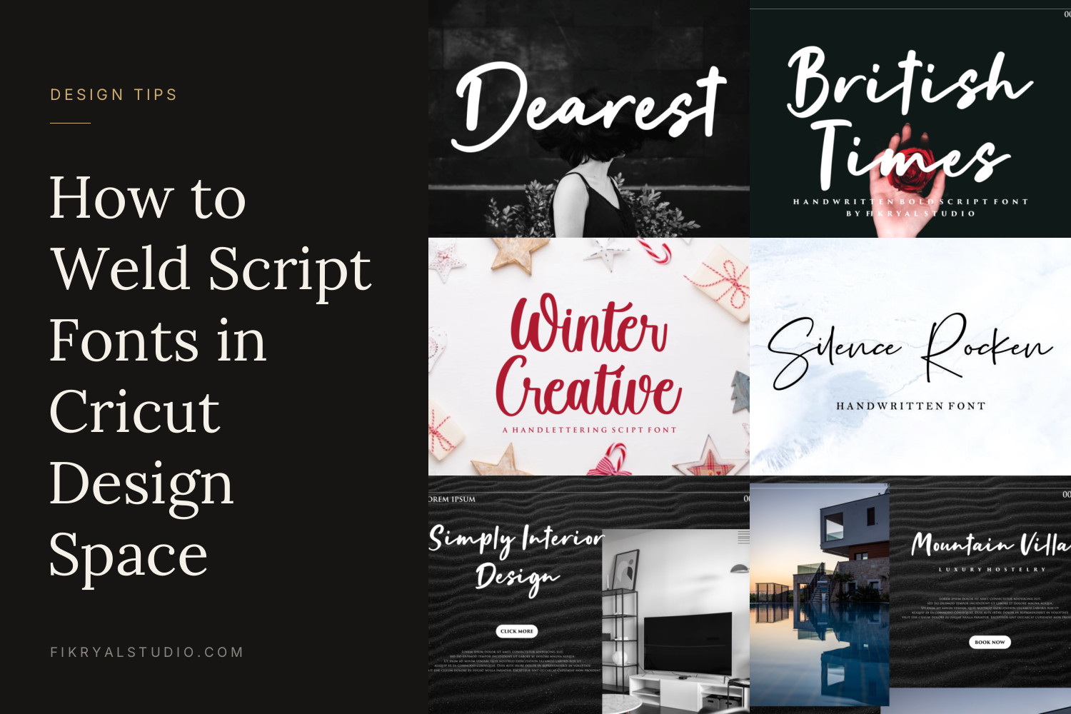
After installing the font on your computer, restart Design Space so it appears in the font list. Mirror the design before cutting HTV. Script fonts need Weld so overlapping letters cut as one piece; our step-by-step guide on how to weld script fonts in Cricut Design Space covers it. For textured brush fonts, a slim Offset behind the text gives you a clean silhouette to cut, with the textured layer printed or pressed on top.
Canva and print-on-demand
Uploading your own fonts to Canva requires Canva Pro or Teams; see how to add your own font to Canva. When exporting for print-on-demand, download a PNG with a transparent background at the platform’s recommended size, and check the preview mockup at 100% zoom for any letters that touch or blur.
Licence: what you need to sell shirts
Every font has a free personal-use version for your own non-commercial projects, such as a shirt you make for yourself. Once a shirt is sold, given out by a business or used to promote anything, you need a commercial licence.
The Desktop License covers personal and commercial projects, including end products for sale up to 2,000 sales, prints or pieces, and logo use. It does not cover social media or websites. If you promote your shirts with designs made in the font on social media, or want to use it inside web tools like Canva, Templett or Corjl, the Monetized Social Media License covers social content and ads up to 100,000 views per month and allows that embedding for the licensee only.
Brush Signature has its own licence and terms, so check its product page before using it on merch. For the full details, read our licence page and our guide to personal use vs commercial use.
FAQ
What is the best font size for a t-shirt?
For a front print on an adult shirt, the main word usually sits between 25 and 30 cm wide, with letter height of at least 4 cm for anything people should read. Small support text should stay above 1 cm tall, especially in HTV.
Which fonts are easiest to cut with a Cricut for shirts?
Bold fonts with thick, even strokes and few loose details cut and weed most easily. In this list, Bigfat Caramel and American Champion are the simplest; textured brush fonts need a larger size or an offset layer.
Can I sell t-shirts made with these fonts on Etsy?
Yes, with a commercial licence. The Desktop License covers end products for sale up to 2,000 pieces, and Brush Signature has its own terms listed on its product page. The free personal-use versions do not cover shirts you sell.