New Year’s Eve design has a short window. Invitations go out in early December, countdown graphics run for one night, and the font you pick has to read as “party” from across a room or on a phone held at arm’s length.
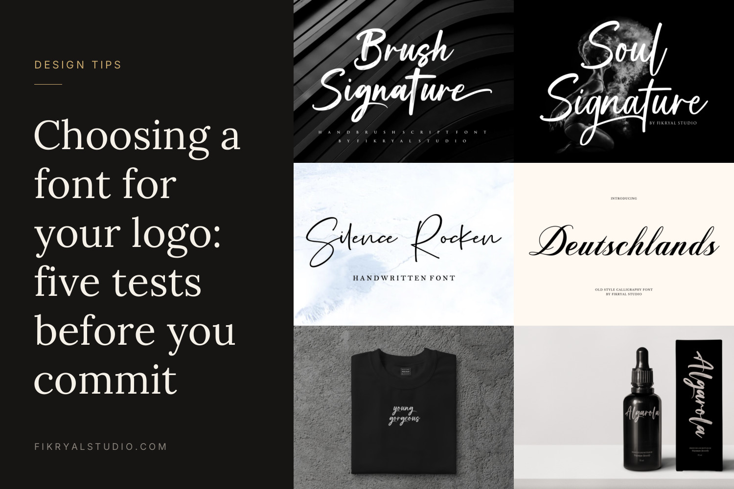
Below are nine fonts from our catalogue that handle that job well, grouped by what they do best, with notes on size, pairing and cutting so you can get your NYE invitations, cards and posts finished before the rush.
Quick picks
- Big headline for a party poster or flyer: Champagne Toast
- Gold-foil numbers and “Happy New Year” lockups: Goldener
- Black-tie gala invitation: Royal Glamour or Dignitary Grandeur
- Loud social posts and countdown reels: Party Anthem
- Elegant script for names and toasts: Glamour Palace or Midnight Reflection
- Handwritten greeting cards: Dearest
- Clean supporting text for dates and RSVP details: Queensides
9 New Year fonts and where each one works best
1. Champagne Toast

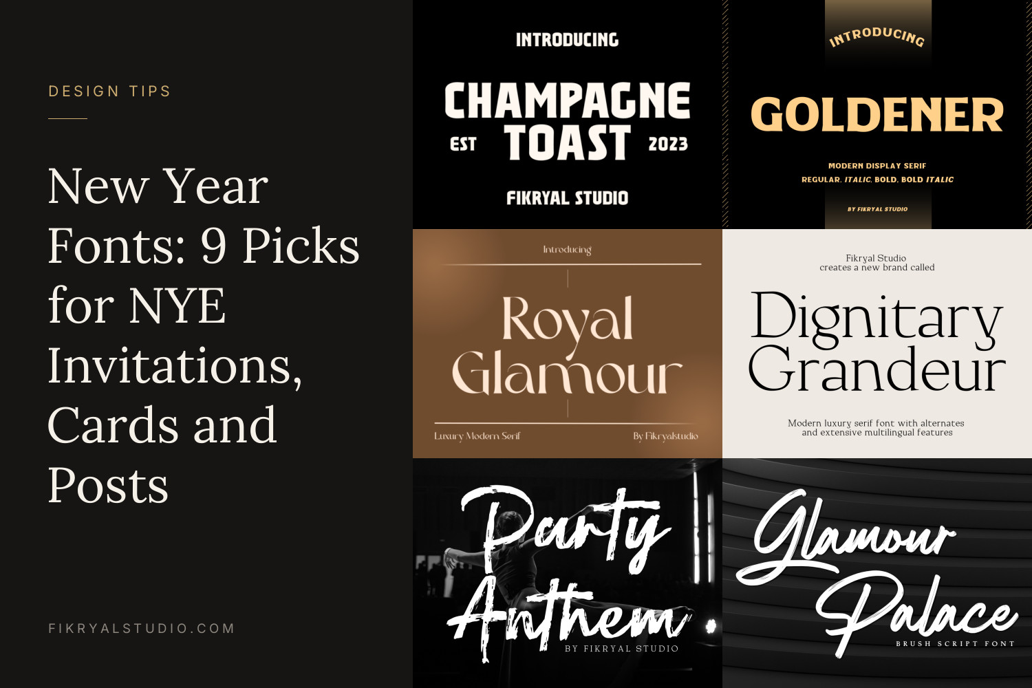
Champagne Toast is a heavy, upright display face set in capitals, with tight spacing and subtle serifs that keep it from feeling blocky. It has the look of a vintage bottle label or a hotel bar sign, which is exactly the mood many NYE parties are going for.
Use it for the one line that has to be read first: “NYE 2027”, the venue name, or “Countdown Party”. On an A4 flyer, 60–90 pt for the headline is a good starting point. Set it in white or cream on black and let a gold accent colour do the rest. See Champagne Toast
2. Goldener
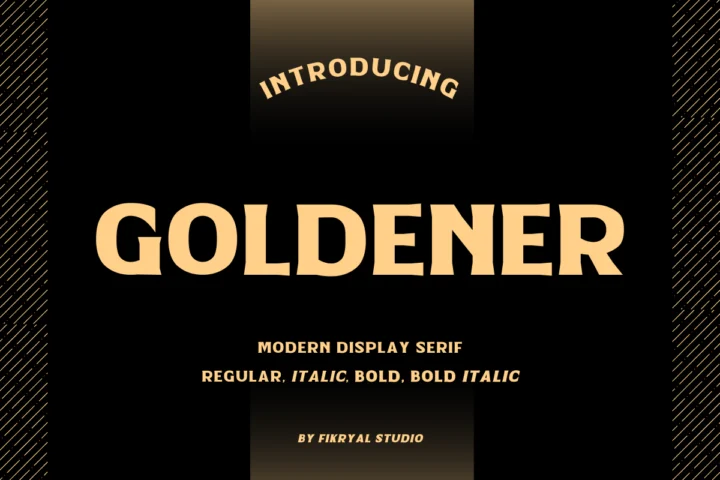
Goldener is a wide, bold serif with sturdy, generous letterforms. The family shown on the cover includes Regular, Italic, Bold and Bold Italic, so you can build a whole card from one font: bold for the year, italic for the greeting, regular for the details.
It is the font we would pick for numbers. A large “2027” in Goldener Bold holds up well under gold foil or metallic vinyl because the strokes are thick enough for the foil to stick cleanly. Keep foil text above roughly 10 pt so the counters do not fill in. See Goldener
3. Royal Glamour

Royal Glamour is a high-contrast modern serif: hairline thin strokes next to thick verticals. It reads as formal and a little fashion-magazine.
It fits a black-tie dinner, a hotel gala or a corporate year-end party invitation. Because the thin strokes are very fine, keep it at 24 pt or larger for print and avoid it for small body copy. Pair it with Queensides for the RSVP block. See Royal Glamour
4. Dignitary Grandeur
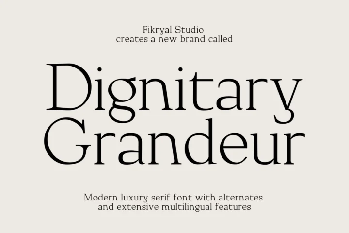
Dignitary Grandeur is a calmer luxury serif than Royal Glamour, with sharp contrast but more classic proportions. The product cover mentions alternates and multilingual support, which helps if your guest list or greeting spans more than one language.
Use it where you want “expensive” without showing off: a menu card for a New Year’s dinner, place cards, or the inside text of a printed greeting card. It also works well in all caps with generous letter spacing (try +100 tracking) for a short line like “A NIGHT TO REMEMBER”. See Dignitary Grandeur
5. Party Anthem
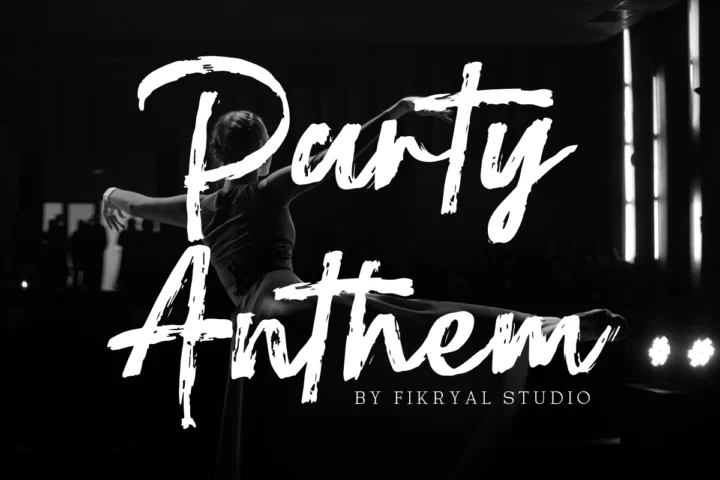
Party Anthem is a dry-brush script with rough edges and fast, energetic strokes. It looks hand-painted, closer to a club flyer or a festival poster than a formal invitation.
This is the one for Instagram stories, TikTok countdown clips and YouTube thumbnails. The texture survives being shrunk on a phone screen, and it sits well over photos of crowds or fireworks if you add a dark overlay of around 30–40% behind it. Keep it to a few words. See Party Anthem
6. Glamour Palace
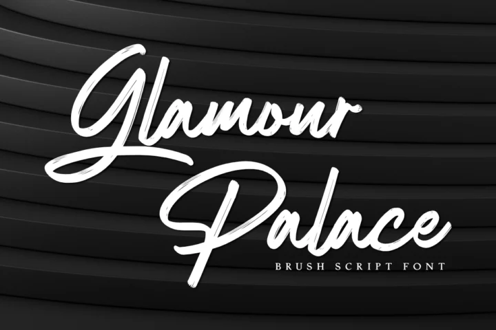
Glamour Palace is a bold, slanted brush script with smooth strokes and long, sweeping capitals. It is cleaner than Party Anthem, so it can go on a printed invitation without looking messy.
Set “Happy New Year” or “Cheers” in it as the centrepiece of a card, then let a serif carry the rest. On a 5×7 inch card, 48–72 pt is a comfortable size for the script line. Its thick strokes also make it one of the easier picks in this list for cutting from vinyl. See Glamour Palace
7. Midnight Reflection
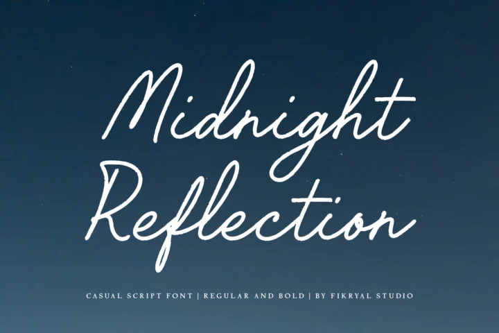
Midnight Reflection is a light, casual handwritten script with tall loops and a relaxed slant. The cover lists Regular and Bold weights. It feels personal rather than glamorous, like a note written just after midnight.
It suits New Year cards to friends and family, resolution journals, planners and quote graphics. Use the Bold weight for anything below about 18 pt or on dark backgrounds, where the thinner strokes can disappear. See Midnight Reflection
8. Dearest

Dearest is a bold handwritten script with thick strokes and a confident, slightly loose rhythm. It is one of our most popular fonts because it stays readable even when it is small or printed on textured paper.
Use it for the greeting on a family card, a “Hello 2027” banner or printed party favours. If you are making gift tags or stickers, Dearest is safer than thinner scripts at sizes around 14–20 pt. See Dearest
9. Queensides

Queensides is a light, rounded sans serif with simple geometric shapes. It is the quiet font in this list, and every New Year design needs one.
Give it the practical lines: date, time, address, dress code and RSVP. It pairs naturally with any of the scripts above and with Champagne Toast on posters. Set it in all caps with wide spacing for a modern look, or in sentence case at 10–12 pt for invitation details. See Queensides
How to choose a New Year font
- The distance test. Print your headline at actual size, tape it to a wall and step back three metres. If you cannot read “Happy New Year” instantly, switch to a heavier font such as Champagne Toast, Goldener or Dearest.
- The dark background test. Most NYE designs are black, navy or deep green with gold or white text. Thin hairlines can vanish there, so preview your font in light-on-dark before you commit. Royal Glamour and Midnight Reflection need extra size in this setting.
- The one-job test. Give each font a single role: one for the headline, one for the details. Two fonts is usually enough for a card or invitation. Our guide to font pairing explains this approach in more detail.
Tips for Cricut, Canva and print
Cricut Design Space. Script letters are separate shapes, so select the text and use Weld before cutting, otherwise each letter cuts on its own. Bold scripts like Glamour Palace and Dearest weed far more easily than hairline fonts. For glitter iron-on or adhesive vinyl on a party sign or champagne glass, keep letters at least 2 cm tall.
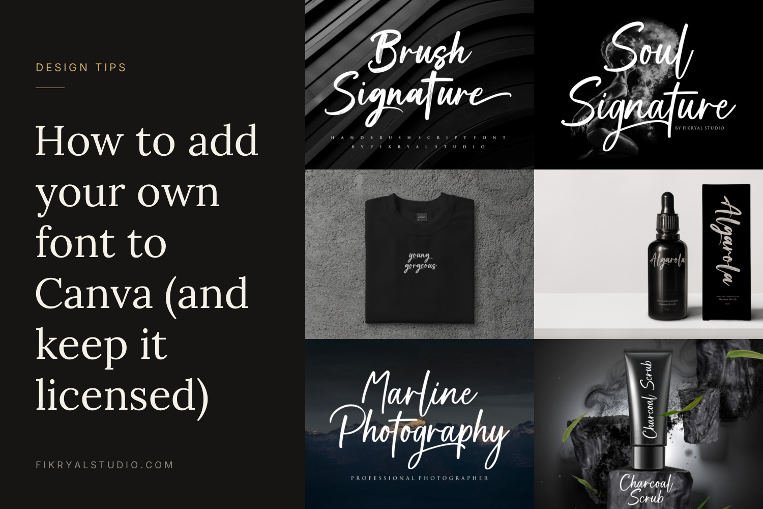
Canva. Uploading your own font to Canva needs Canva Pro or Canva Teams. We walk through the steps in how to add your own font to Canva. If you sell or share Canva templates, check the licence section below first.
Foil and printing. For gold foil or metallic ink, choose bolder fonts and avoid very small hairlines. Export print files as PDF with fonts embedded or outlined, and leave a 3 mm bleed if your design runs to the edge. Planning labels for bottles or party favours? Our post on designing packaging labels with display fonts covers sizing and contrast.
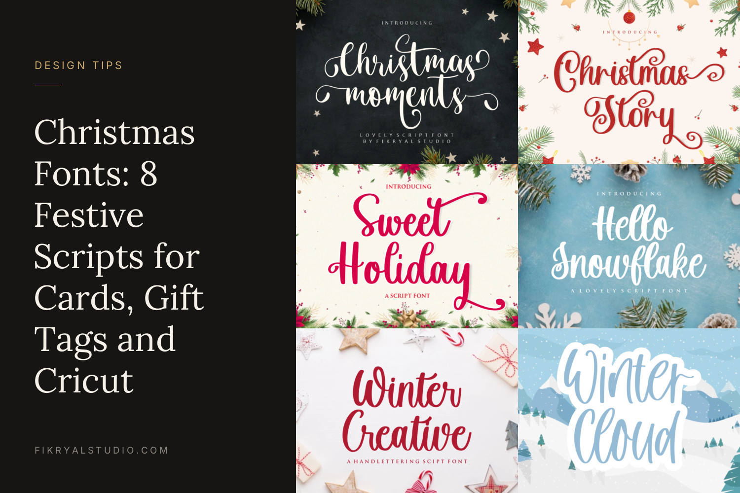
Looking for something more seasonal before New Year? See our list of Christmas fonts.
Licensing your New Year designs
Every font in our shop has a free personal-use version you can use for your own non-commercial projects, such as a card for your family or a poster for a party at home.
If you are selling or promoting anything, you need a paid licence:
- Desktop License: personal and commercial projects, including end products for sale up to 2,000 sales, prints or pieces, and logo use. It does not cover social media or websites.
- Monetized Social Media License: social media content and ads up to 100,000 views per month. It also allows the licensee to embed the font in web tools like Canva, Templett and Corjl, which matters if you sell editable invitation templates.
- Webfont License: use on one website.
Dearest has its own licence terms, so check its product page before using it commercially. Full details for all licences are on our license page.
FAQ
What font is best for a New Year’s Eve party invitation?
A bold display or serif headline with a clean sans serif for the details works for most invitations. Champagne Toast or Royal Glamour for the headline, with Queensides for the date and RSVP, is a reliable combination.
Which font looks good for “Happy New Year” on a card?
A script gives the greeting a personal feel. Glamour Palace looks dressy, Midnight Reflection feels relaxed and personal, and Dearest stays readable at smaller sizes.
Can I use these fonts for New Year products I sell on Etsy?
Not with the free personal-use version. Physical products like printed cards or shirts need at least a Desktop License, and editable templates sold through Canva, Templett or Corjl need the Monetized Social Media License. Read the license page for the exact limits.