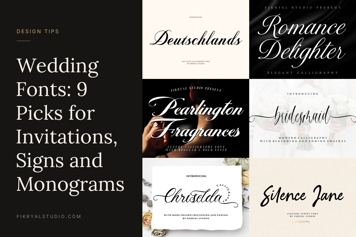
Most couples pick a wedding font from a preview that shows the font’s own name, then discover it looks very different once their names, the date and a venue address are set in it. The fonts below are chosen for the actual jobs on a wedding suite: names on the invitation, details guests need to read, signs people see from across a room.
Every font here has a free personal-use version, so you can test it with your real names before you decide.
Quick picks
- Classic, black-tie invitations: Deutschlands or Romance Delighter
- Bold names that hold up in gold foil: Pearlington Fragrances
- Light, airy invitations with flourishes: Bridesmaid or Chriselda
- Monograms and joined initials: Silence Jane
- Relaxed, boho and outdoor weddings: Dearest
- Dates, addresses and RSVP details: Queensides or Royal Glamour
9 wedding fonts and where each one works best
1. Deutschlands

An old-style calligraphy with a steady slant and a clear contrast between thin upstrokes and heavier downstrokes. It reads like careful pen work rather than quick handwriting, which is why it suits formal invitations, place cards and the couple’s names on an order of service.
Set it in black or deep navy on ivory card. Because the letters are fairly compact, longer names like “Alexandra & Christopher” still fit on one line of a 5×7 inch card at around 36 pt.
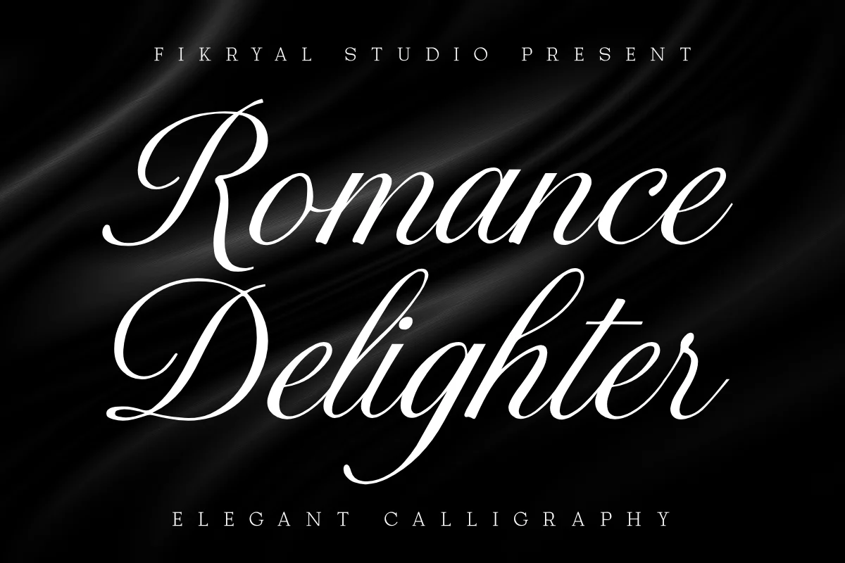
2. Romance Delighter
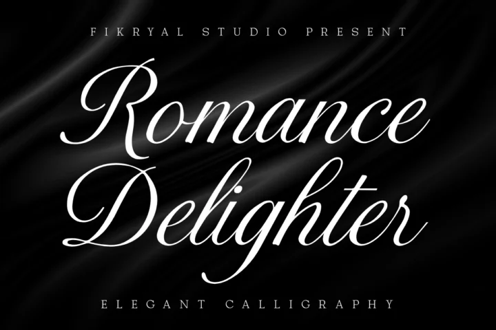
A formal calligraphy with tall, sweeping capitals and fine hairlines. It has the feel of an engraved invitation, so it pairs naturally with heavy cotton paper, wax seals and a restrained colour palette.
Give it size. The hairlines are delicate, so keep it at 30 pt or more in print and avoid using it for anything smaller than a name.
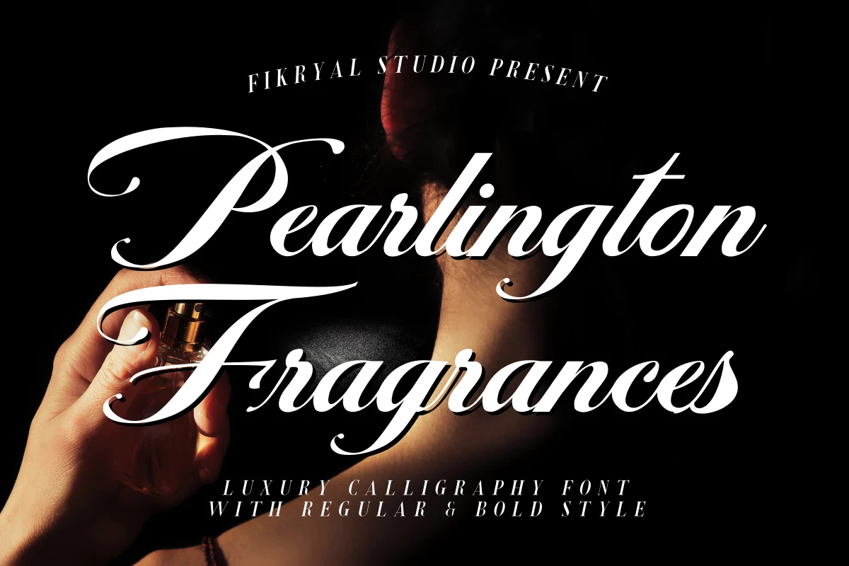
3. Pearlington Fragrances
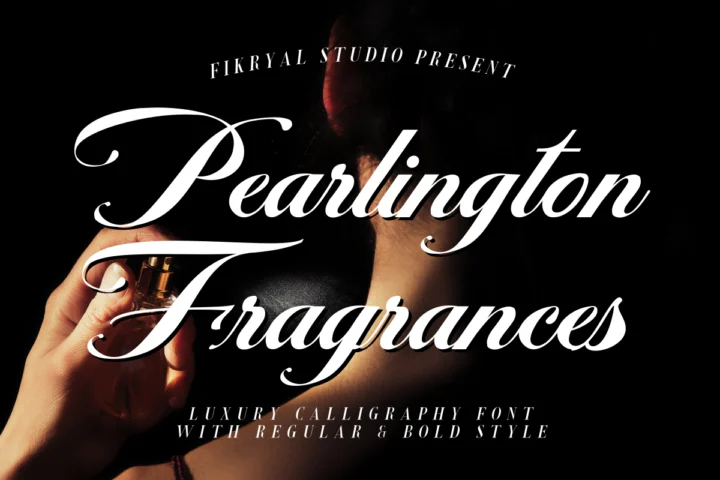
A luxury calligraphy with heavy downstrokes and dramatic capitals, offered in regular and bold styles. The weight is the reason to choose it: thick strokes survive gold foil, letterpress and white ink on dark card far better than a hairline script.
Use the bold style for the names on a dark navy or emerald invitation and the regular style for smaller lines such as “together with their families”.
4. Bridesmaid

A light, modern calligraphy that comes with beginning and ending swashes. Those long strokes can sweep under a name or frame a short line like “Save the Date”, which gives a hand-lettered look without drawing anything yourself.
Use one swash per name, not on every word. It works best on clean layouts with plenty of white space: save-the-dates, menus and welcome signs for garden or spring weddings.
5. Chriselda

A bouncy calligraphy with more beginning and ending swashes than most scripts in our library. The rhythm is playful but still elegant, so it sits comfortably between formal and relaxed.
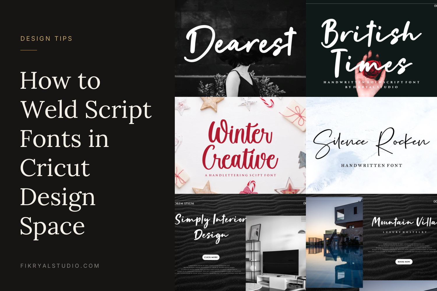
It looks good on menus, table numbers and thank-you cards. If you cut it on a Cricut for signage, weld the letters first; our guide to welding script fonts in Cricut Design Space walks through it.
6. Silence Jane
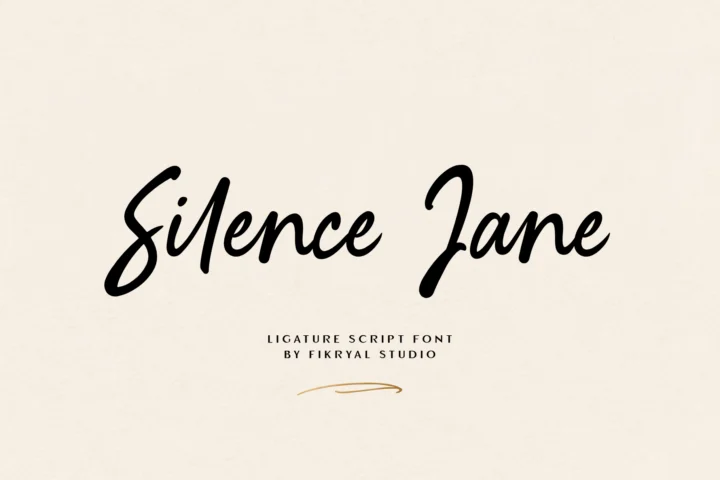
A ligature script, which means some letter pairs join into a single connected shape. That makes it a strong choice for monograms, joined initials and the couple’s names on a crest or a cake topper.
Type your real initials before you commit. Ligatures only appear for certain letter pairs, and the type tester on the font page shows exactly how your combination looks.
7. Dearest

A bold, handwritten brush script with a confident, casual feel. It fits beach weddings, barn and outdoor celebrations, and couples who want their stationery to sound like them rather than like a formal announcement.
Because it is heavy, it works well over photos: an engagement picture on a save-the-date, or a large welcome sign that people read from a distance.
8. Queensides

A thin, elegant sans serif with rounded shapes, released as a family of four fonts. It is not a script, and that is the point: it handles the date, time, venue and RSVP details so the script can stay on the names.
Set it in capitals with a little extra letter spacing for a modern, airy look. It pairs especially well with Bridesmaid and Deutschlands.
9. Royal Glamour

A luxury modern serif with strong contrast between thick and thin strokes. Use it where a script would be too much: headings on the programme, the menu courses, or the couple’s names on a minimalist invitation with no script at all.
It pairs naturally with Romance Delighter and Pearlington Fragrances, which share the same high-contrast character.
How to choose your wedding font
- Test with your real names. “Emma & James” looks good in almost anything. Your actual names, with their own capital letters and letter pairs, might not. Type them into the tester on each font page before you shortlist.
- Print one card at full size. Screens make thin strokes look sharper than paper does. Print a test at 100% and look at it from arm’s length. If the hairlines fade, choose a heavier script or set it larger.
- Use one script and one plain font. The script carries the feeling, the plain font carries the information. More than two fonts makes a suite look busy. Our guide to font pairing explains how to give each font a job.
Sizes that work on a wedding suite
- Invitation (5×7 inch): names 36–60 pt in the script, details 10–12 pt in the sans or serif.
- Place cards: guest names 24–30 pt. Pick a script with clear capitals so names are easy to find.
- Welcome sign (A1 or 60×90 cm): names around 200–300 pt so they read from several metres away. Heavier scripts like Dearest or Pearlington Fragrances work best here.
For more on layout, spacing and printing, read how to use script fonts on wedding invitations.
Which licence do you need?
If you are designing your own wedding stationery and nobody is paying for it, the free personal-use version covers it.
You need a paid licence when the work is commercial:
- Designing invitations for clients or selling printed stationery: the Desktop License covers end products for sale up to 2,000 prints.
- Selling editable templates on Etsy, Corjl or Templett, or using the font inside Canva for paid work: the Monetized Social Media License allows embedding the font in those tools.
- Dearest has its own licence options, so check its product page for details.
Not sure which applies to you? Compare every licence in plain words.
FAQ
What is the most readable wedding font?
For names, a script with clear capitals and moderate contrast, such as Deutschlands or Pearlington Fragrances. For dates and addresses, use a sans serif or serif like Queensides or Royal Glamour, because scripts slow guests down when they read numbers.
Can I use these wedding fonts in Canva?
Yes. Uploading your own fonts needs a Canva Pro or Teams account. We explain the steps and the licence you need in how to add your own font to Canva.
How many fonts should a wedding invitation use?
Two is the sweet spot: one script for names and one plain font for everything else. A third font is fine only if it has a clear, separate job, such as a monogram.